A place to dump logo ideas, things we might use for a banner image, etc. Please don’t upload anything directly, yet; upload elsewhere and link. Site storage is still in flux.
Uploading to this page is now fine but be aware that images will be compressed and resized. It shouldn’t matter because we would want any logos to be small, anyway!
Here are the suggested logo dimensions and things for the configurable options on the ‘branding’ page:
“The logo image at the top left of your site. Use a wide rectangular image with a height of 120 and an aspect ratio greater than 3:1. If left blank, the site title text will be shown.” – so this is where it currently says ‘Cosmo Canyon’
“The small logo image at the top left of your site, seen when scrolling down. Use a square 120 × 120 image. If left blank, a home glyph will be shown.” – right now that’s a scratchy speechbubble
And then it suggests uploading things with same dimensions for the mobile site, as alternate logos for dark mode, and for the email summary. Not bothering to copy paste those descriptions since they have the same dimensions. It does say email image should NOT be a svg.
Favicon = will be resized to 32/32 . That’s currently an orange gradient square also currently a scratchy speechbubble, in the browser tab this time.
It also mentions these:
“large icon: Image used as the base for other metadata icons. Should ideally be larger than 512 x 512. If left blank, logo_small will be used.
manifest icon: image used as logo/splash image on Android. Will be automatically resized to 512 × 512. If left blank, large_icon will be used.”
I can’t for the life of me work out where either of these would be used. Splash screen? What, where?
It also suggests apple touch icon; this will be resized to 180x180. Don’t know if any of our users use apple touch.
And then it suggests uploading an opengraph image, which I think is used as a preview if the site is linked elsewhere. That should be 280x150.
Oh, and we can have a push notifications icon if we want:
“The badge icon that appears in the notification corner. A 96×96 monochromatic PNG with transparency is recommended.”
And for the ‘geometric’ site theme, it is possible to have some form of background image. That looks like fun to try out so we’ll try that next.
edit: it is now nice and fiery.
Hm, it should show up if you go to your user preferences and then select “discourse-geometric-theme” as the theme; it’s not the default since it’s quite loud (default should now have a gradient in the header though!). So, click user icon in top right, tab with a little person icon, preferences, and then you want the bit that says “interface”; if you’re on mobile there’s a dropdown on the right which will say “Account” by default but “interface” should be at the bottom of that list.
Edit: Oh, though looks like the background image is mostly invisible on mobile anyway; only shows up when page is loading… Can see it on desktop, though.
Aaand it seems to really slow things down on mobile. Not sure if that’s caused by fetching the image or something else. It’s not a very big image. Something to test!
I think it’s to do with the elements trying to resize to fit the mobile screen. Testing in a different mobile browser… Yeah, it was the browser. Should be fine on Brave.
Actually no it freaks out after a little while. Best sticking to default theme on mobile. Should be fine to choose a different colour scheme, though.
And a third, with higer contrast noise, since compression smooths that out…:
And ANOTHER, with less contrast since that looked silly:
and a small one to see if it stops compression.
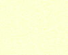
aaaaaaaand again:
hopefully the last:
alas.
There! (used Noise Texture CSS Generator | CSSmatic ; 91%, 80%, fcffba, fbffca, defaults. Then took smallish screenshot so it would not get compressed, and uploaded. We hope edits no not give others notifications…)
6000 identical yellow squares later, and we’ve disabled them on mobile anyway because they slowed the page load. The discourse-default-desktop theme is the same as this one but with the textured background. They’ll probably get out of sync, though.
I can’t see any of those either. FWIW, I’m using a Macbook Air and Google Chrome.
I’m quite good at Photoshop (I’m sure others are too). Would you like me to make some possible logos? Or how about asking Mideel Tourist Board to make something? Or you, maybe?
I’m not sure if this refers to the steps in the directions to change the theme left a couple of comments up, or the dastardly yellow squares. The squares don’t matter (and will blend in with background on default theme, making this thread sillier); the steps to change theme are slightly different on desktop because the layout is a little different; can check the specifics shortly but it’s similar. If you can see the themes dropdown on your user preferences page and it’s empty, can you get a screenshot? That would seem to be a bug.
Oh yes, anyone here who’d like to contribute logos etc should feel free! Haven’t requested anyone specifically because that seems like something someone should be commissioned for, and this doesn’t seem like the right situation for that; if a thread like this is public please assume it’s open to all! I will steadily make placeholder logos and things if nobody else does, but I think anyone else here would do a better job. It’s ideal if we can collectively design the site, just don’t want to pressure busy people.
Man, I’d love to see the sparkly and over the top 90s style comic sans mess! xD All those ideas sound great though. I was thinking a little flame for the favicon would be nice, though wondered if what I was picturing might look too much like some other site that I can’t remember (firefox? some mail client? eh nope it’s gone). The gradient’s there as a placeholder but it’s a bit boring. I’d like to get a nice starry background at some point so we can have the option of a stargazing/space theme!
EDIT: and just checked on desktop, to change theme it’s user icon on top right, person icon, ‘preferences’, and then ‘interface’ is on the bottom left. Really recommend everyone sticks to default on mobile, though; it’s possible to have one theme on desktop and a different one on mobile, and it’s still possible to change colours on mobile, but yeah anything else seems to slow my poor little mobile down.
Just noticed we can also have pictures for the “categories”! That is, the sections of the site like “FF7” or “Site Meta” or indeed “Uncategorised”. I expect we’ll have more categories with time as we see what needs its own space to keep things tidy… Anyway yeah, more places for pictures!
Draft quality, but here are the silly ones! If I made a final version of the space one, the background would be tiled, and there would be at least two lens flares. The text would probably have a 3D look to it. I think there would be more stuff in the sunset one as well, but I’m not sure what.
My instant thought was of Nanaki using Photoshop! <3 In sunset one… bird silhouettes? (Idk what else to put in the sky) Outline of canyon rocks in the distance? Stars?
These are wonderful! Let’s go with the round observatory one, then. (I like the stars but I think the round edges will look nicer, and it’s good that that the observatory one has the orange in as well. I’d guess stars at the top might make it too busy, though I wonder if it could work)
EDIT: oh, hm, it’s raather hard to see, isn’t it? It auto resized so not sure why it looks so small, if it’s an optical illusion or if it actually shrank…
EDIT #2: Tried a few, would say the best as a favicon was the moon, because it’s simple and has enough contrast. Have left as the observatory for now so everyone can see it. Maybe an orangey version of the moon (mars? :P) would work so that we keep the canyon rock colour?
Have put some of Mideel’s pics by the categories! Some are there more as placeholders since they were initially intended as favicons, though we can always leave them that way if we prefer it.
It looks nice! And I think the higher contrast in yours makes sense for a favicon. I like how there’s a bit of red/orange with the yellow in the second one.
 If people prefer the black we can change it back.